


.svg)

.svg)


Track Company Analytics with SaaS KPI Dashboards: A Comprehensive Guide in 2024


Co-Founder & CTO
Imagine driving without a map, GPS, or phone telling you where to go. That's what running a SaaS business without an effective SaaS KPI dashboard feels like. You might be headed in the right direction, but without constant monitoring, reaching your destination becomes a guessing game.
As the bridge between go-to-market (GTM) teams, Revenue Operations (RevOps) teams need SaaS KPI dashboards to navigate business metrics and condense crucial data into a visually intuitive interface. In this guide, we’ll discuss why KPI dashboards are important, how to select the best KPIs for your business, and how to create dashboards that’ll empower you to make data-informed decisions.


The Importance of SaaS KPI Dashboards
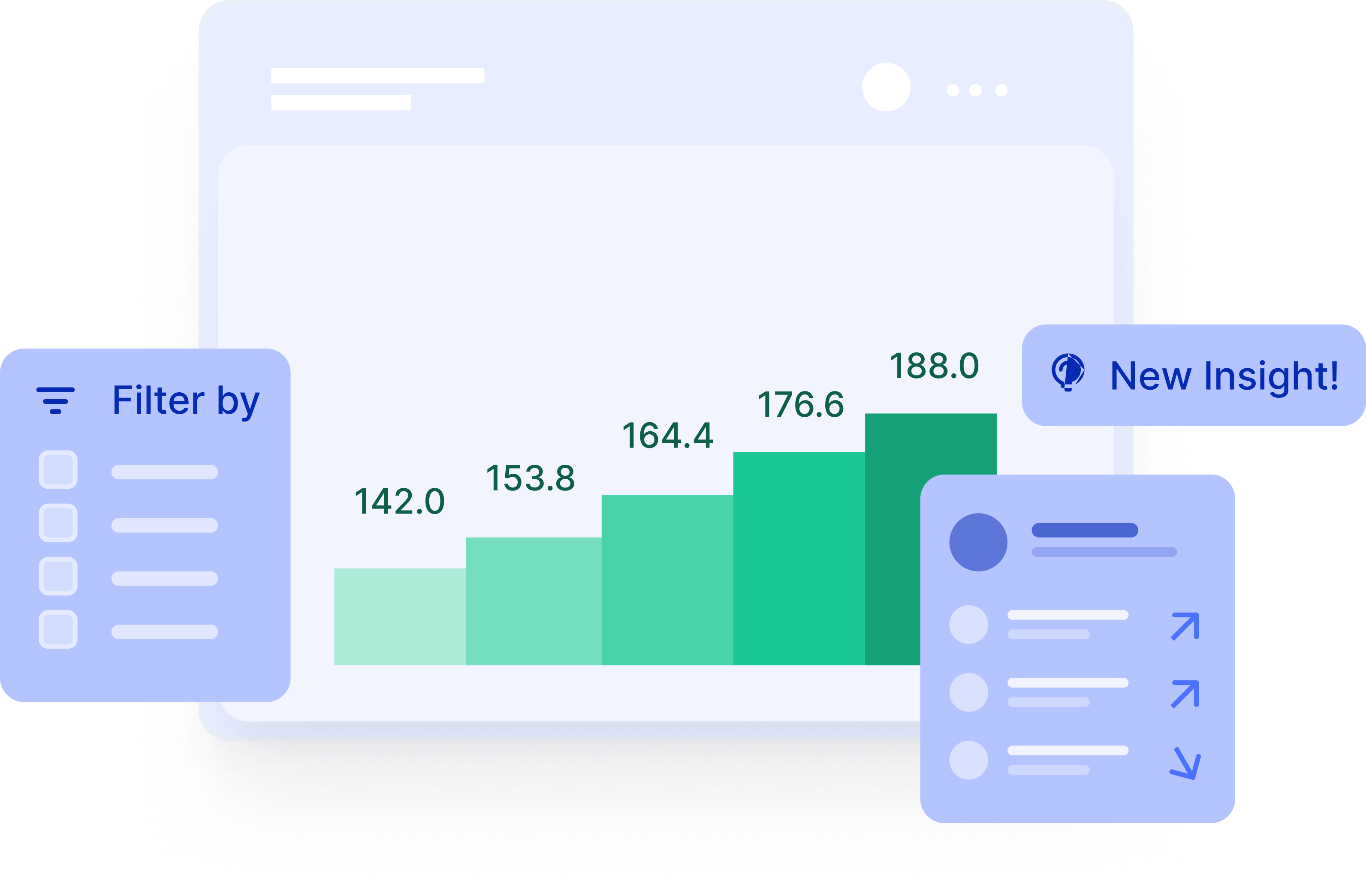
A SaaS KPI dashboard or SaaS metrics dashboard is a visual tool that displays key metrics, allowing you to better understand the health of the business, monitor progress, identify areas for improvement, and make data-driven decisions.
While not all SaaS KPI dashboards offer the following benefits, a robust analytics platform provides teams with:
- Visibility: The dashboards compile all your key metrics from sales, marketing, finance, support, and development onto a single screen, providing a holistic view of your business health.
- Data-Driven Decisions: By tracking trends and identifying patterns, you can make informed decisions based on real-time insights, not gut feelings.
- Improved Performance: Continuous monitoring keeps your team focused on what matters most, allowing them to optimize strategies and drive better results.
- Enhanced Communication: Dashboards foster transparency and alignment across departments, ensuring everyone is marching in the same direction.
Selecting the Right KPIs for Your SaaS Business
There isn’t a set standard for SaaS KPIs. Every business and every team will have different needs, but there are a few tips to help you select the best KPIs for your dashboards.
Align metrics with your company’s overall goals:
A great place to start is your company’s overall business goals. What is the business’ main focus for the next year, 3 years, or 5 years? Use these overarching goals to align your key metrics.
Prioritize actionable metrics:
Ask yourself the following questions when identifying KPIs to track:
- What metrics can your GTM teams influence? For example, most GTM teams can influence lead conversion rates and pipeline creation.
- What metrics are heavily influenced by external factors? While metrics like market share or share of voice within the market are helpful pulse checks, they don’t provide many actionable insights, and probably shouldn’t be incorporated in your dashboard.
- What is a vanity metric vs. one that shows you the state of the business? Metrics like impressions or influenced pipeline are often considered vanity metrics because the numbers aren’t directly tied to revenue.
Create dashboards for each GTM team:
Each team will have individual metrics it needs to review in order to understand the health of its marketing program or sales funnel, for example. Create a “big picture” dashboard that pulls in key metrics to review the overall state of revenue at the company in addition to individualized dashboard’s that drill into metrics specific to each team.
Define your KPIs:
It’s important to be marching toward the same overarching goals and KPIs, and to do that the definition of the metrics or KPIs needs to be the same across the organization. Align GTM teams across a set of standard KPIs that the company as a whole can use to track progress.
Dashboards may be a lot easier to navigate than their Excel spreadsheet predecessors, but with so many data points and visual options available, it can still be challenging to craft user-friendly dashboards. Consider the following design tips to create dashboards that all teams can follow.
- Focus: There’s a tendency to add as many metrics as possible, but that can create an overwhelming visual experience. Instead of overloading your dashboard with every metric under the sun, prioritize the KPIs that directly impact the business or team’s goals.
- Visual Clarity: Use charts, graphs, and gauges to present data in an easily digestible way. When in doubt, choose simple and clear over highly-designed visuals.
- Details: Allow users to dive deeper into specific metrics for further analysis. This provides context and helps identify root causes of issues.
- Customization: Cater your dashboard to different roles and departments. Executives might want a high-level overview, while marketing teams need deeper insights into campaign performance.
Sightfull pre-built dashboards

What to Look for in a SaaS KPI Tool
When evaluating SaaS analytics dashboards, look for tools that will easily integrate with your current systems, provide actionable insights, and empower your GTM teams to make data-informed decisions. Below are a few key aspects to consider:
Easy integrations for a comprehensive view:
Your GTM teams likely have multiple tools that they use to evaluate the success of their functions. You’ll want to make sure that each of these tools, from your CRM to marketing automation to financial systems easily integrate with your KPI dashboard. When exploring solutions for your KPI dashboards, keep integrations at the top of your list. You’ll want to be able to seamlessly pull in data from multiple sources.
Real-time data analysis and reporting
Timely data is crucial in order to make quick, informed decisions. Prioritize platforms that pull data in real-time so you can ensure you have the most accurate data at your disposal.
Scalability and future-proofing your dashboard
As your company grows, so does the quantity of data and the number of teammates that need access to that data. When you consider scalability, think about the platform’s ability to accommodate your data needs as well as the number of users and ability to share the dashboards across the company.
Security and compliance
Look for a dashboard with robust security features and data encryption to protect sensitive information. Platforms should be SOC2 and ISO27001 compliant to ensure your data is protected.
User-Friendly Dashboard Design
Platforms that offer an easy-to-use user experience will be much easier to adopt across the organization. Look for a no-code solution that can be shared with non-technical teams. This will increase collaboration and help teams stay aligned on their overarching goals. A bonus item would be a platform that has pre-created dashboard templates. The templates can make your experience getting started much smoother as you're able to plug in your data to quickly access the insights you need.
Customization
While pre-created templates can be incredibly helpful to get started, make sure you also have the ability to customize the templates and dashboards for your business needs. Every business has metrics unique to them, so you’ll want to be able to incorporate and define those metrics as you see fit.
If you’re looking for a SaaS KPI dashboard that fits all of the above criteria, Sightfull is a revenue analytics platform that offers full integration and results in just hours. Its no-code solution provides user-friendly dashboards that can easily integrate with your existing Business Intelligence tech stack or stand alone. Access real-time data in seconds so you can feel empowered to make the best decisions for your business.
Make the best decisions for your business.
SaaS KPI Dashboard Examples
Sightfull offers a variety of templates to help you create dashboards for specific teams or processes. Let’s take a look at a few examples below.
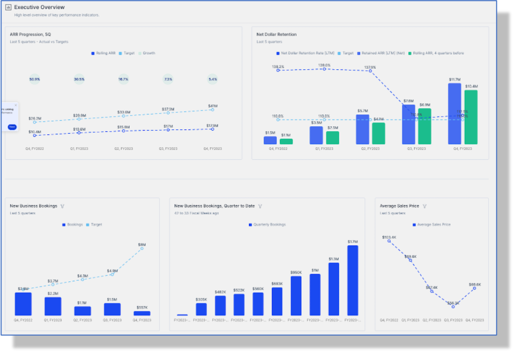
SaaS Executive Overview Dashboard Example
Your executives will want to see the big picture, so put together a dashboard that includes overall business numbers. Executives will have the option to drill down deeper by clicking into any of the charts and graphs.
- Rolling Annualized Recurring Revenue (ARR): This metric looks at the total ARR at the end of a specific period. It focuses on the revenue contributions from individual deals that have been successfully closed by the sales team.
- Net Dollar Retention Rate: The net dollar retention rate measures the share of the current ARR linked to the customer base that was active in the previous period.
- New Accounts: The number of new accounts or logos that became active.
- Churned Accounts: The number of accounts or logos that have disengaged from your company.
- Average Sales Price: Also known as average deal size, shows the monetary value of closed-won opportunities.
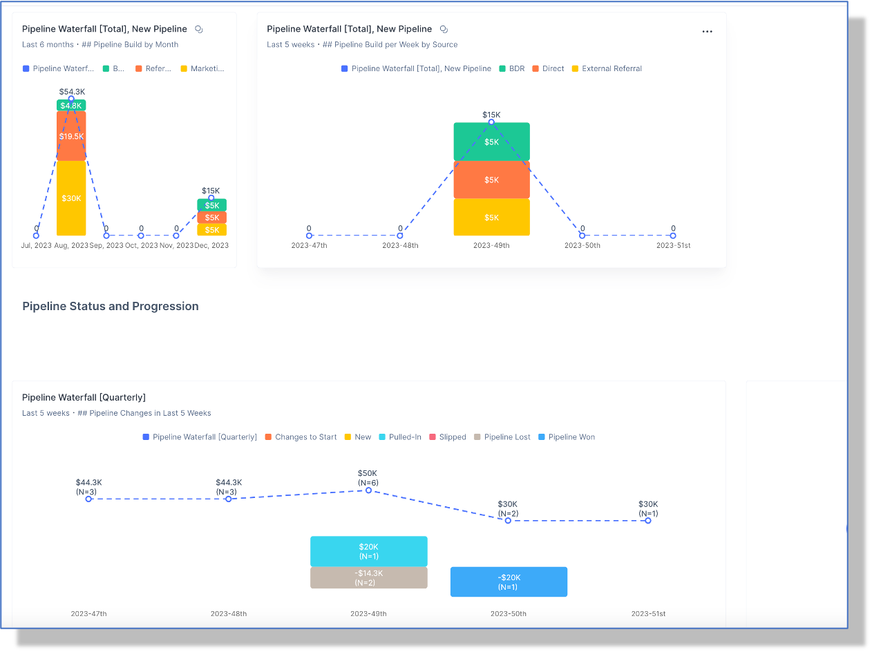
SaaS Sales Dashboard Example
The Opportunity Management dashboard is a great way to keep a pulse on the sales for the business. Whether you’re on the RevOps team and looking at how to improve sales pipeline or a sales manager looking for insights into team performance, this dashboard allows teams to identify areas for improvement.
Pipeline waterfall for this quarter: An overview of the development of pipeline opportunities.
Pipeline Creation: The number of new pipeline opportunities created during the period.
Deals Slipped: The number of deals that didn’t close within the expected timeframe.
Deals Lost: The number of deals that are closed lost.
Deals Won: The number of deals that are successfully closed won.
SaaS Marketing Dashboard Example
Marketers and RevOps teams need to understand marketing campaign performance and how those campaigns are contributing to pipeline. The graph below dives into the Campaign Contribution to Pipeline by quarter. Other metrics that are frequently in marketing dashboards include:
- Leads Converted: The number of leads that successfully converted to sales opportunities.
- Leads by Channel: The number of new leads from each marketing channel.
- Lead-to-MQL Conversion Rate: The percentage of new leads that convert into Marketing Qualified Leads (MQLs).
- Lead-to-SAL Conversion Rate: The percentage of leads that were accepted by sales as potential opportunities.
Turn Data into Actionable Business Strategies
When there are so many data points to consider, it’s easy to get lost in the numbers. To turn your data into actionable insights, remember to:
- Tell a story: When sharing data with other teams or executives, don’t dive into detail with each data point. Instead, share the story of what the data is telling you. This will be much easier for others to understand and you can always dig into the details if the team has questions.
- Remember to look at the big picture: You can spend hours digging into every detail and idiosyncrasy, remember to step back and look at the big picture. The details can help you troubleshoot, but the big picture will shine light on the overall health of the business.
- Bring in other teams: Collaborate to understand why sales might be light one month or MQLs high another month. Talk with your marketing and sales counterparts for the full picture.
- Learn and adapt: Your dashboards aren’t set in stone. Adjust the graphs and charts within your dashboard to make it as helpful as possible to yourself and other teams.
Harness the power of Sightfull's platform
Staying Ahead: Adapting to Technological Advancements
To stay ahead of the curve and make sure you’re on top of any advancements in data, select a B2B SaaS dashboard that is constantly being iterated upon. This will help you have the best data and insights faster than your competitors.
Sightfull, for example, is always exploring new ways to enhance its platform and help customers gain insights through data. Sightfull recently announced its latest Generative AI tool, Sightfull AI assistant, to help you free up time to focus on more complex tasks.
By leveraging Sightfull AI in data analytics, you can:
- Quickly analyze large amounts of data
- Identify patterns and trends
- Automate repetitive tasks
At Sightfull, we’ll help you adapt to the latest tech advancements—learn more about Sightfull AI
A SaaS KPI Dashboard Built to Scale
Remember, your SaaS KPI dashboard is a living document, not a static snapshot. Adapt it as your business evolves and your goals change. Use it to celebrate wins, learn from setbacks, and course-correct when needed.
By harnessing the power of SaaS KPI dashboards, you can transform your business from directionless to heading confidently toward your desired destination.
Consider Sightfull, a revenue analytics platform, to help you build SaaS KPI dashboards that will scale alongside your business.
- Full integration and results in just hours
- A user-friendly solution (no-code required)
- Real-time revenue intelligence
Ready to build your own SaaS KPI dashboard?
Start tracking your SaaS metrics
Stop being in the dark; leverage pre-calculated metrics to gain visibility into your business, understand performance, and report on SaaS, sales, and marketing metrics